
August banners at IKEA
Launched in IKEA stores worldwide today, here is a a selection of some of the latest news that I wrote the global master copy for. Below you can see some of my banners (taken from the US site) and to read the full presskit I wrote, please follow this link:


Sneak peak of the August news
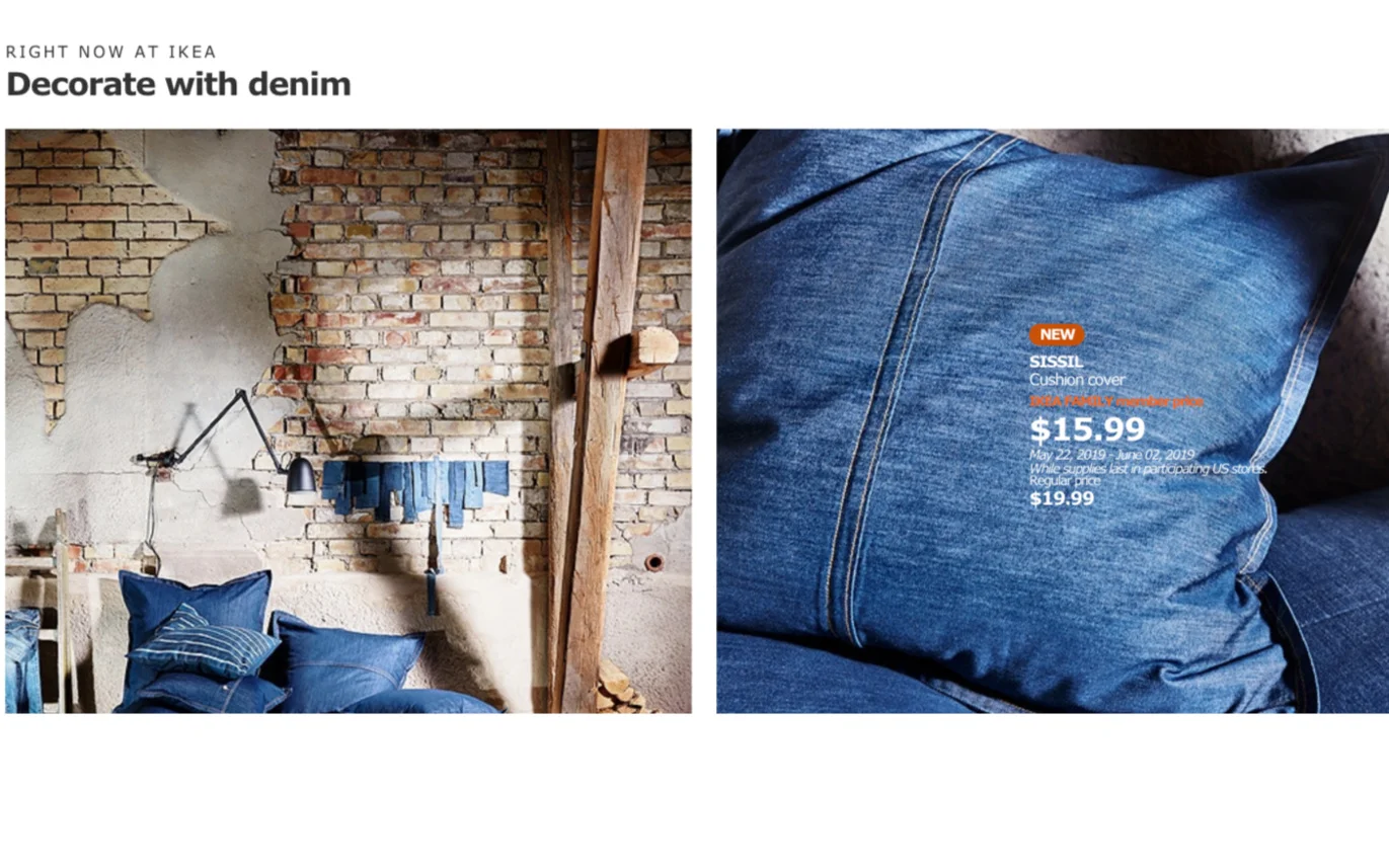
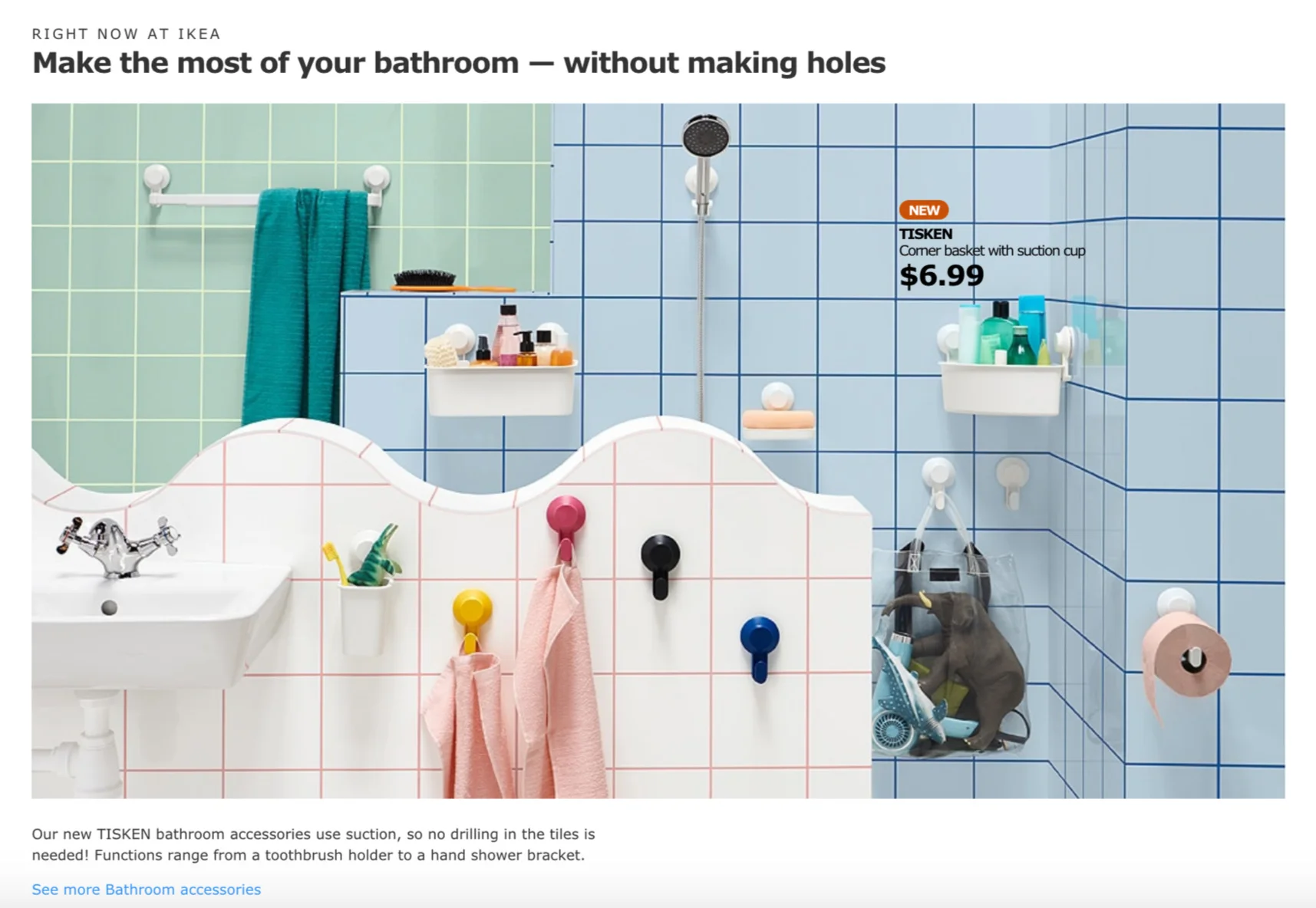
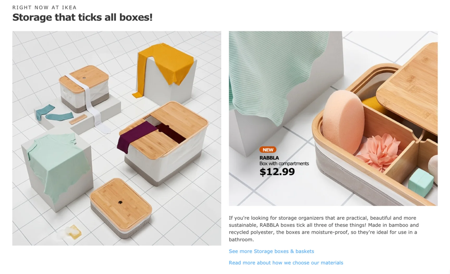
The August news at IKEA is all about making a fresh start with expressive patterns, complementing colours and contrasting materials. It’s an opportunity to organise the home and choose pieces that work to the max. See the bold imagery and the entire press kit I wrote here.


Summer news at IKEA
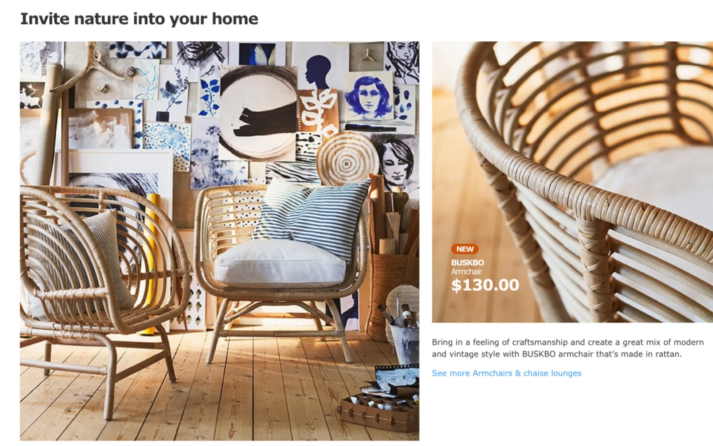
The summer launch at IKEA is about making time to live a more conscious and caring life regarding sustainability. The materials are natural and the colours span from neutral, earthy tones to different shades of blue. See some of the banners below, and read the presskit I wrote here:


Springtime at IKEA
With the spring launch in full swing at IKEA, here are some of the banners I wrote that can be found across the different IKEA sites in the world. As you can see, spring is full of colour!


Writing for BRIO
During the autumn, I was given the opportunity to delve into the colourful and playful world of BRIO. Now, the retail catalogue is here! I contributed with category pages communicating key sales points, designer quotes, as well as brand pages for their play, design and sustainability philosophies. Read some of them here.


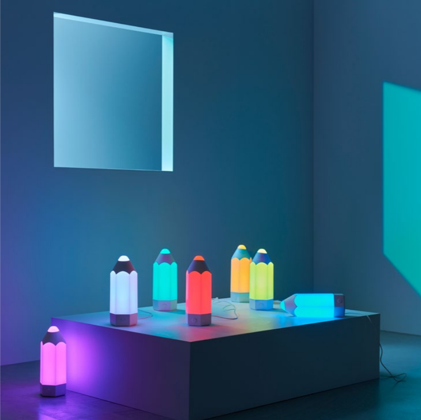
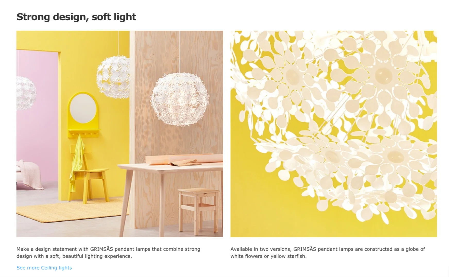
Colour play at IKEA
February at IKEA is all about boosting the energy in your everyday life. The launch finds new ways of coordinating and combines joyful colours with bold and graphic patterns inspired from 1960s. Read the presskit that I wrote here:

Copywriting musings

“As a writer, one spends a lifetime journeying into the heart of language, trying to minimize, if not eliminate, the distance between language and thought.” (Arundhati Roy)
This quote really sums up the main message from CopyCon18, held in London in the autumn. It was a great day filled with a mix of speakers including copywriters and professional trainers that brought a wonderful programme of learning and inspiration. A lot of the talks focused on how to make your copywriting sharper — using language without pretension, making copy more concrete and also how to achieve this on a sentence level. Other topics included tone of voice for different fashion brands and the power of using metaphors in copywriting. Overall, it was time well spent and I came away with new insights.


Autumn feelings at IKEA
The October launch at IKEA is fashionably floral with lots of rich patterns and colours for an eclectic style. As part of the entire launch package, I produce the master copy for the IKEA websites. Here is a selection of banners I’ve written (taken from the US and Australian sites).


My team also made a beautiful launch film covering some highlighted products. See the film here:

October at IKEA

The October launch is probably one of the favourites I've worked on for IKEA. The style is traditional and very British. The launch is about making room for playfulness and following one’s own mind. The mood is fashionably eclectic, the colours are rich and patterns go from florals to chequered.
I'll post more of my work for this launch shortly, meanwhile you can enjoy the press kit I wrote here:

Copywriting conference, London
This year I'll be attending the Copywriting Conference in London arranged by ProCopywriters.
I look forward to new insights, inspiration and connections. Take a look at the agenda!


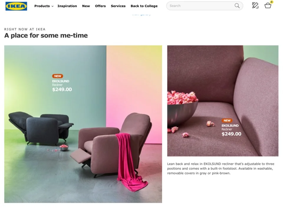
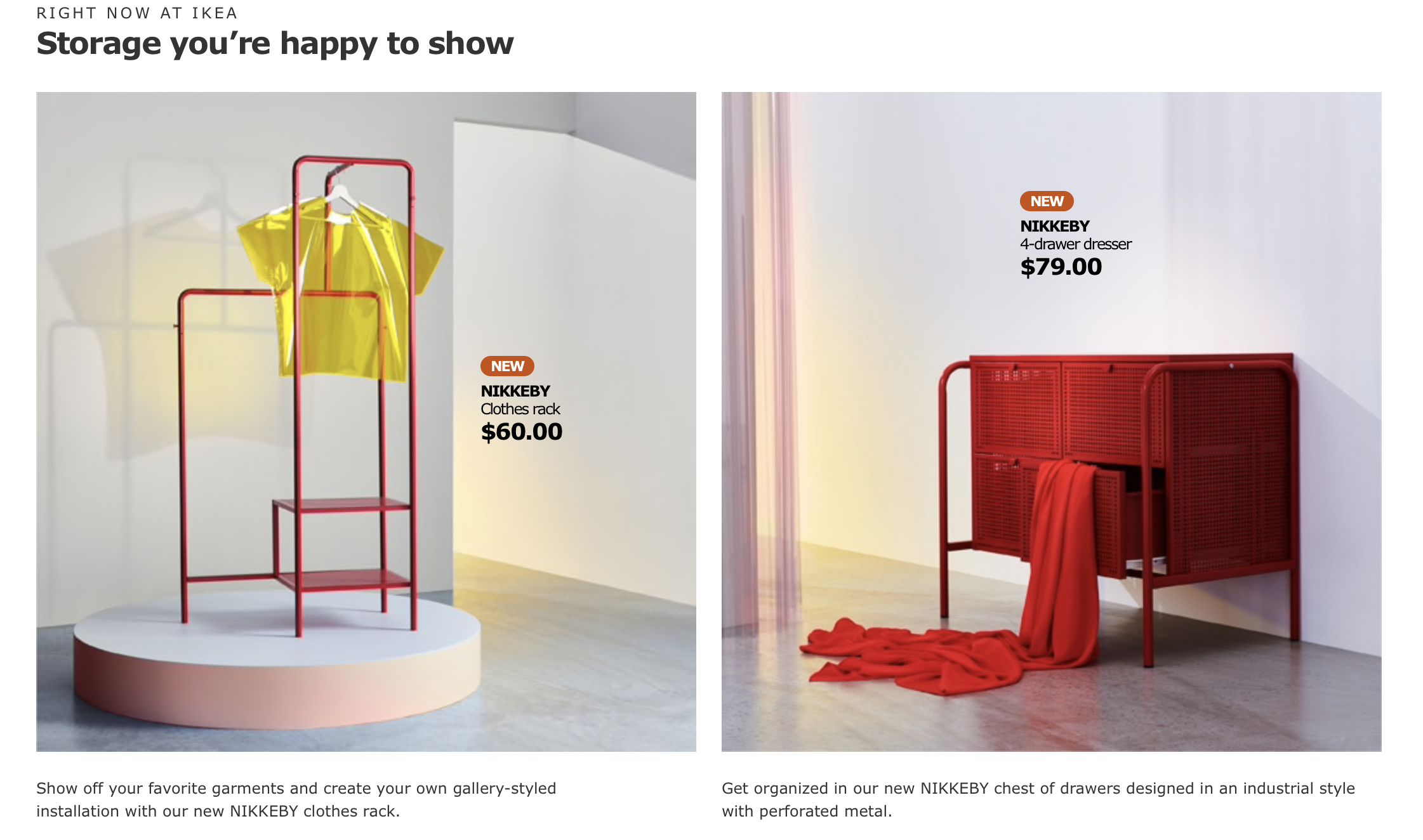
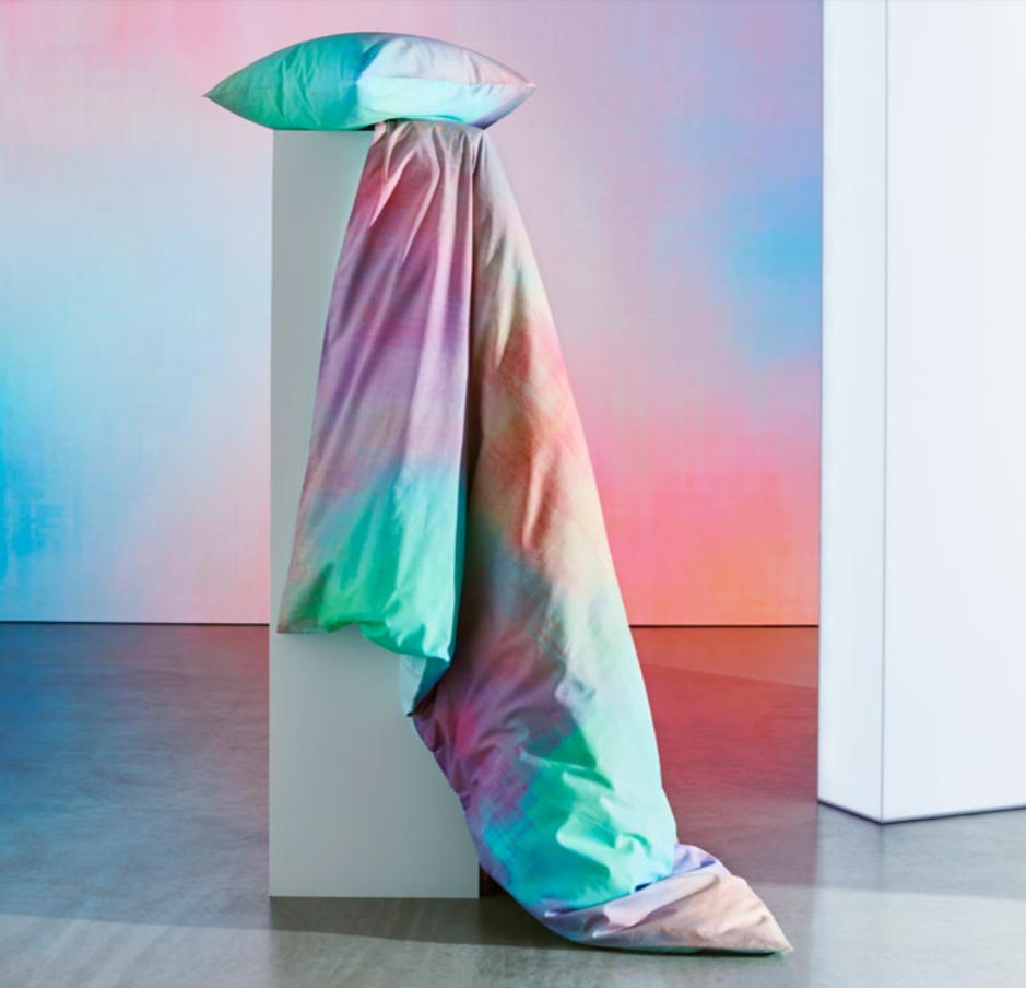
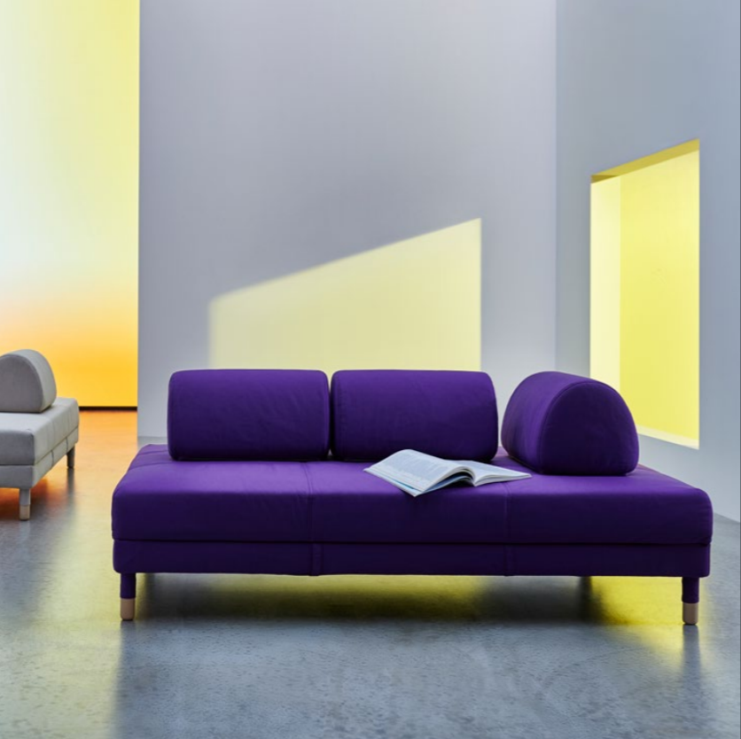
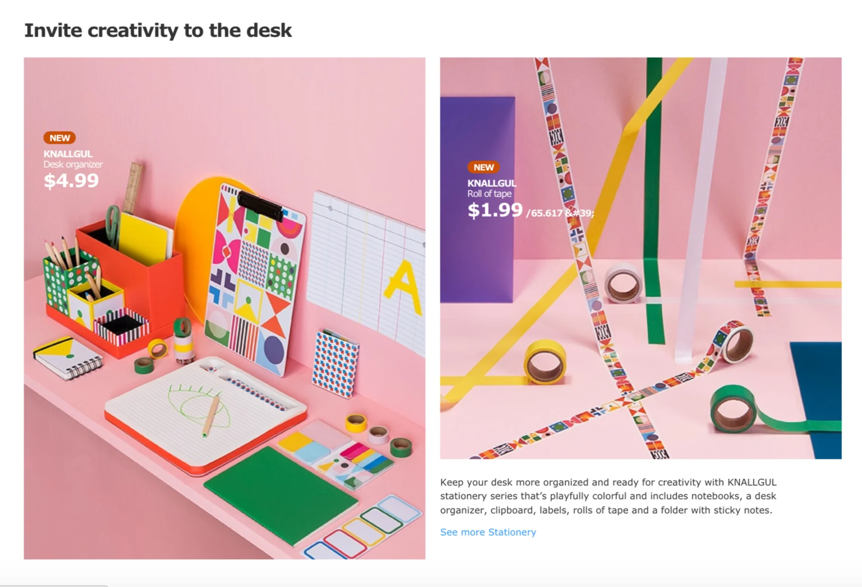
New work for IKEA
Here's a selection of published work launching new products for IKEA in August 2018 (examples are taken from the US IKEA site). This launch had a poetic mood in pastel tones. To read the entire presskit I've written, follow this link.


